Overview confusing

When I jot down quotes from a book or notes, MarginNote creates ultra-long - and therefore very confusing - columns. If I categorize the notes chapter by chapter with subheadings (nodes), a further level is created but the columns do not become shorter. Even if I show the top level (s) as “framework” and the lower level (s) as “tree”, it doesn’t get any clearer.
I think it would be clearer if I could define the width of a node (in levels) more broadly myself.
How do you make it clearer?

There are several talkings about better navigation/clarity before, especially for big maps.

unfortunately there was no improvement…

But personally I create another framework consisting links of headings. It looks like summarised portrait of main framework. Maybe it work for you too:

3 Likes

Thanks for the hint.
I suppose, you don’t put your ‘table of contents’ into the framework with the cards (into the above left corner, where it normally belongs), because then MarginNote arranges the table automatically somewhere in the nowhere …

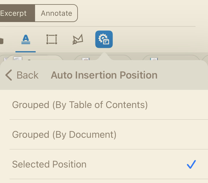
You are welcome.
There is no placed table of contents in my pdfs. When you capture every page and headings, you create your own table of content at the same time. You ll get what I mean with this:

1 Like