I do like your app and it has so powerful and amazing features. But, unfortunately it has some really serious disadvantages and because of them it’s almost impossible to use the app. But I want to!
Terrible and almost not visible added note symbol to a highlighted text.
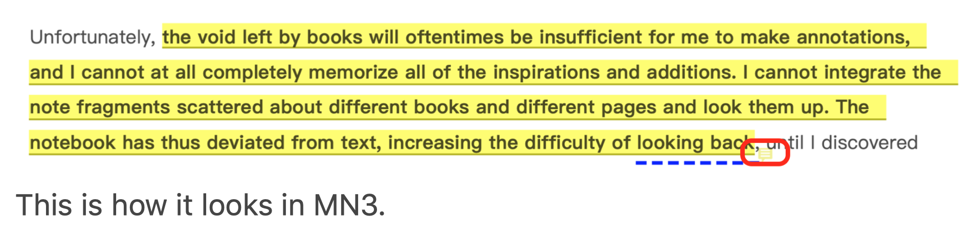
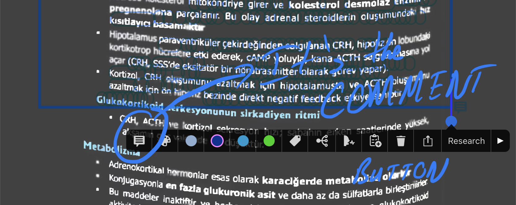
This is how it looks in PDF Expert.
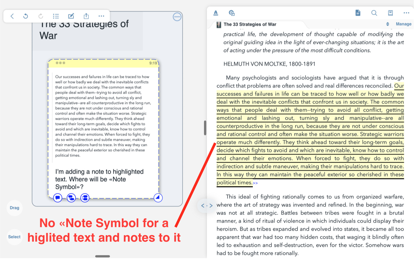
When I add a note to a highlighted text in PDF Expert this note symbol appeares ALWAYS on the left and it’s always easy to see. And this is how it should look like in MN3.
But it’s more interesting with ePub: I don’t see any «Note Symbol» for a highlighted text with a note to it:
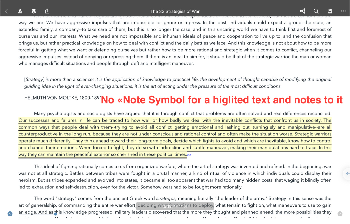
While there is a note, actually:
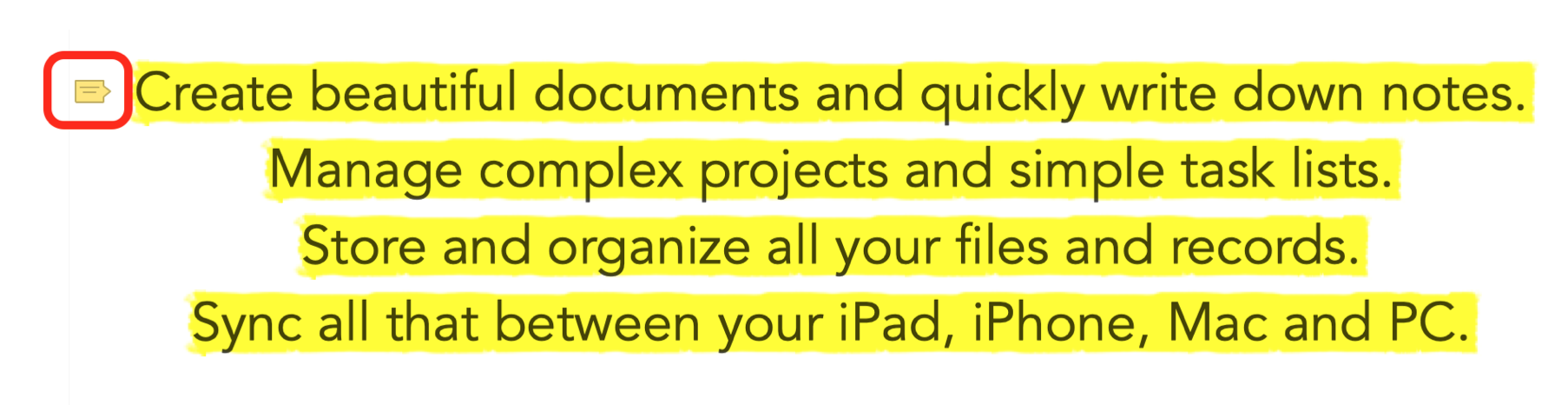
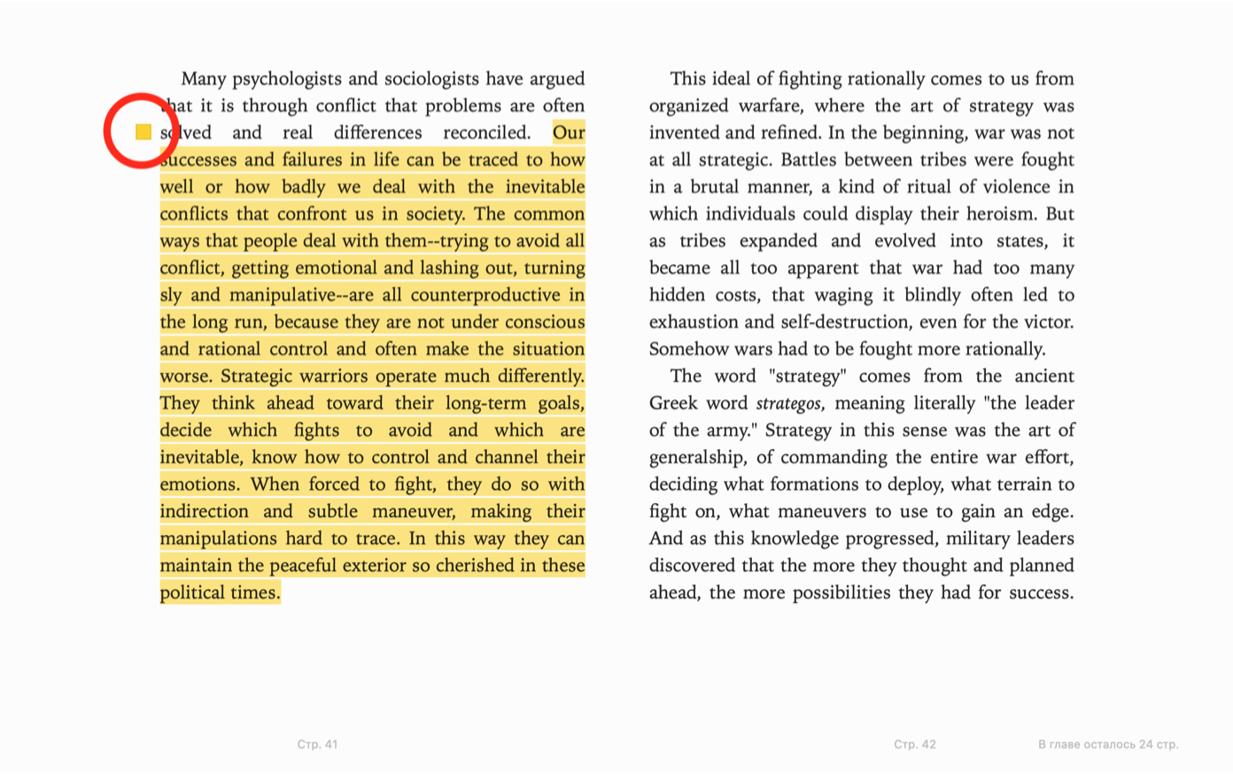
But in iBooks on Mac or iOS this «Note Symbol» is also always on the left (like in PDF Expert):
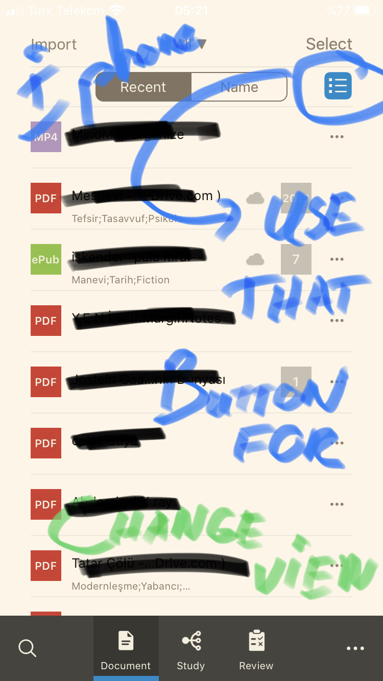
Absolutely inconvenient thumbnails view
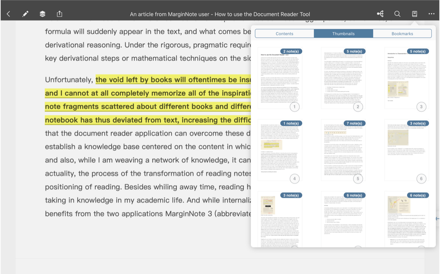
This is how it looks in MN3: its impossible to read any text here as thumbnails are too small.
Also I can’t rearrange pages if I need to.

This is how it looks in PDF Expert: easy to read any text. And your app should look like this too.
Terrible layout for files in “Document” section
Especially on iPhone.
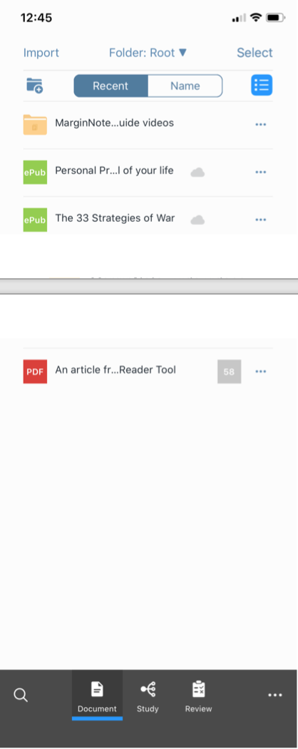
I have 2 books that start the same but they have different names in a middle and at the end. In MN3 I don’t understand what is what.
Support for Files browser.
I don’t like that I’ve to copy any PDF or ePub book inside MN3. Please add native support for Files browser so I could choose any file in iCloud Drive, use share extension “Open in MN3” (not “Cope to MN3”).
Sync reading position between devices.
So I could start reading on Mac and continue on iPad or iPhone.