Hi developers,
I’d like to suggest a couple of improvements to the yellow color options.
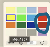
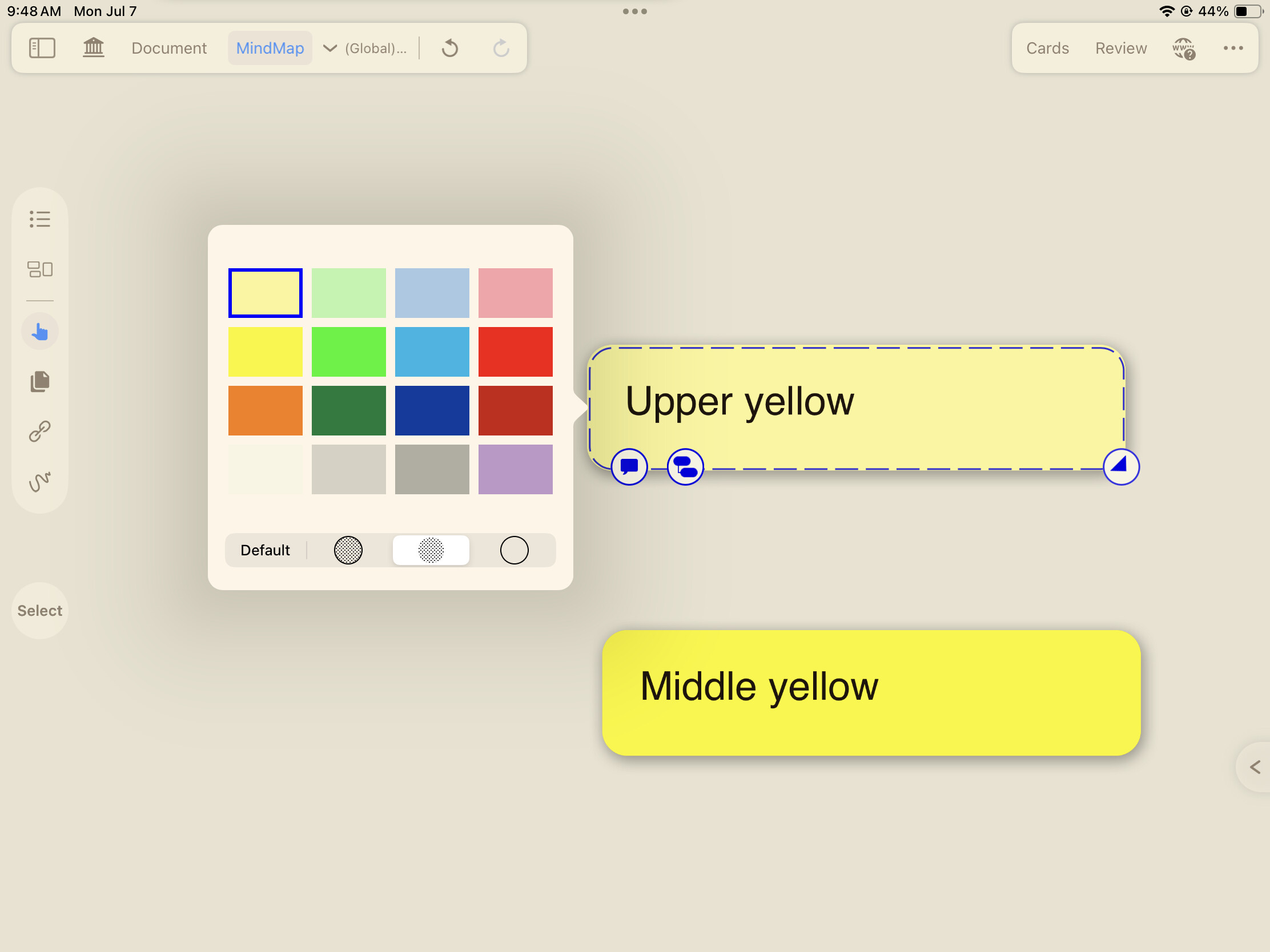
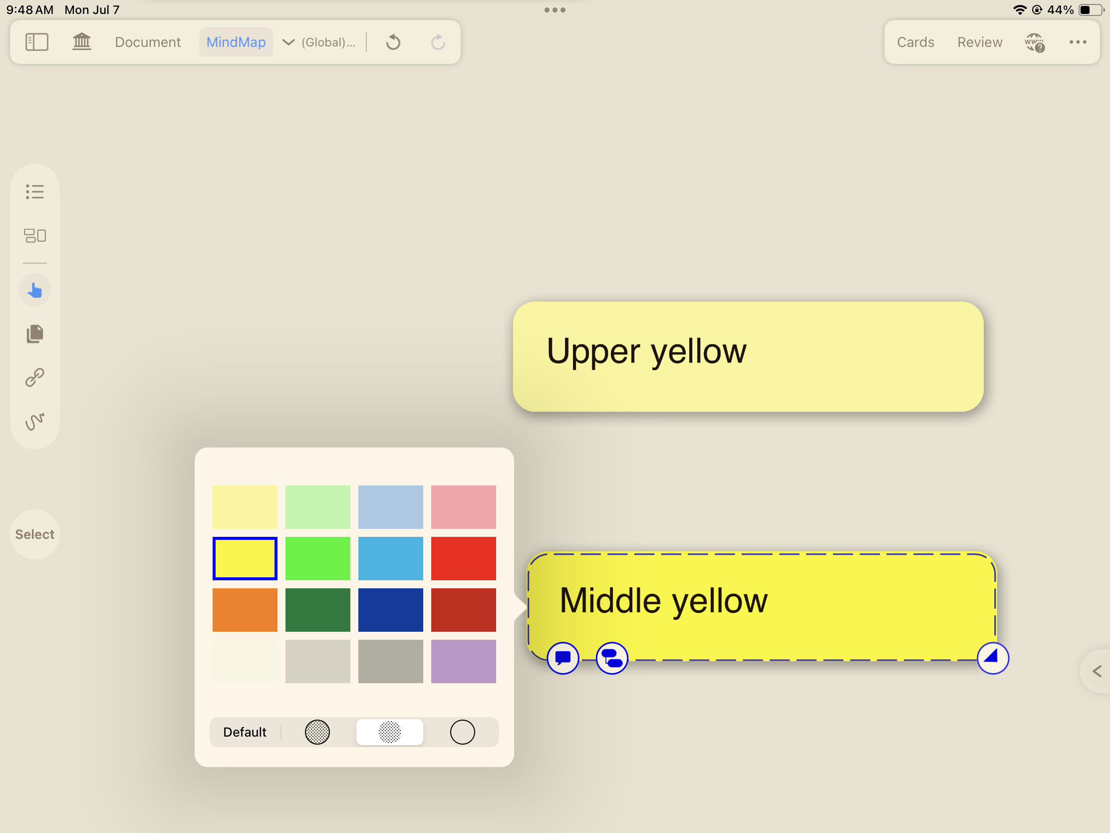
- Note Card Colors: The two lightest yellow colors for note cards (“Upper yellow” and “Middle yellow”) are very similar, making them difficult to distinguish from one another at a glance.
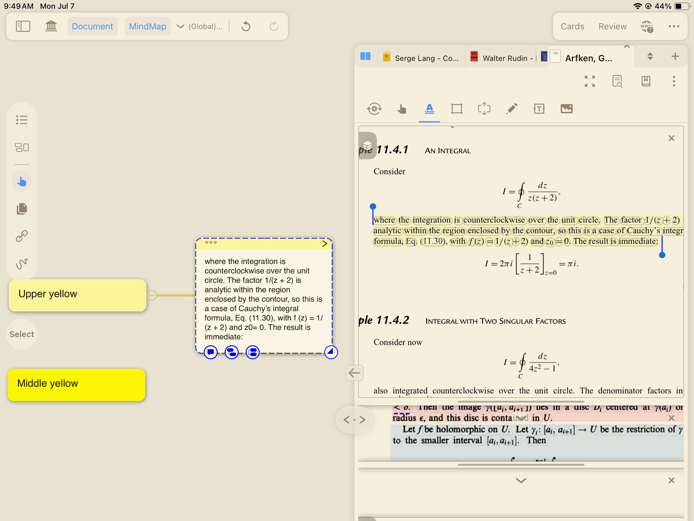
- Highlight Visibility: The lightest yellow (“Upper yellow”), when used for highlighting text in a document, is too transparent and faint. This makes the highlighted text difficult to see.
Could you please adjust the lighter yellow color a bit for better visibility and distinction, both for note cards and for document highlights? It could be even better if users could customize the colors of the note cards and document highlights.
Thanks for your consideration!