When will you CREATE ATTRACTIVE THEMES FOR OUTLINES. ??
,
Hello
Hello, thank you for the screenshot. My native language is not English and viewing the handwriting is a bit difficult for me, would you mind if you could just send me the text. Thank you very much.
Kind Regards,
MarginNote-Edward
Support Team
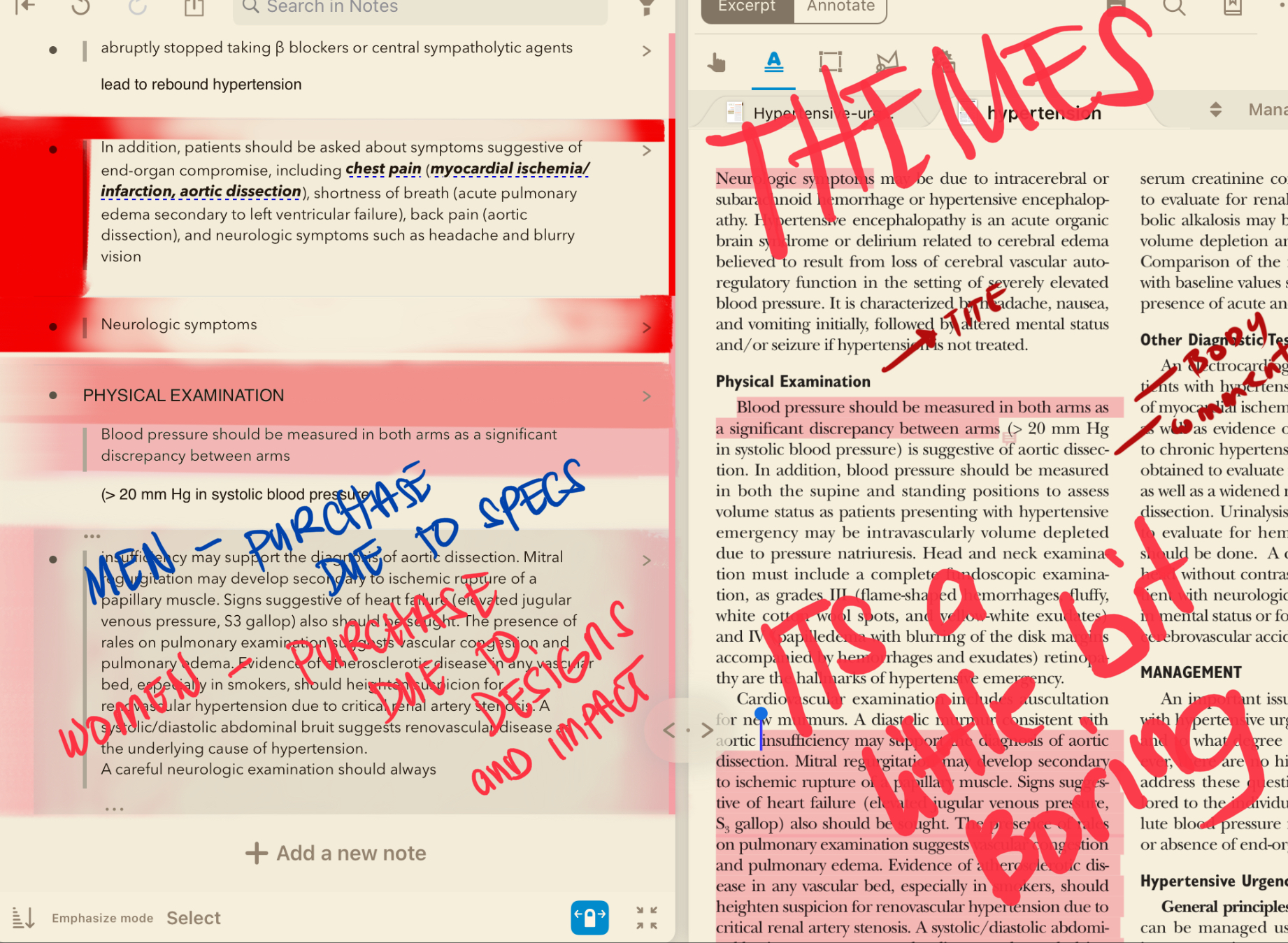
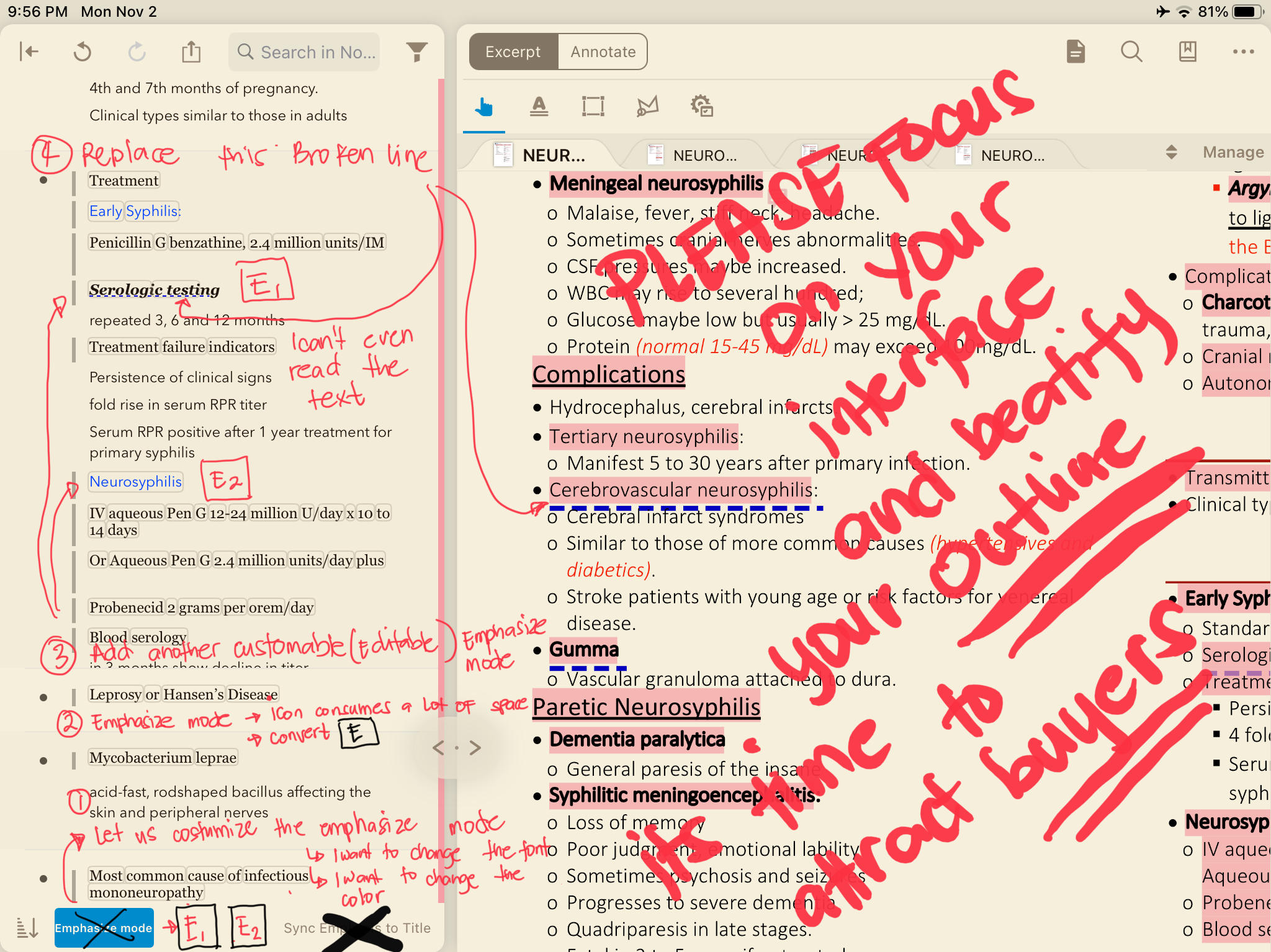
What im saying is instead of putting the word “emphasize mode” put an icon like E1 on the outline. Put a pop up on the icon to describe the function of each icon This will save you alot of space for ipad user that has small monitors.
Secondly . My request is can you please add another emphasize mode beside it(3 or more ) labeled as icon “ E2 “. ( in which i can customized it with diffrent color and font ) this is for easy highlighting of the outline.
: you can see i love changing the colors of my words to categorized it further and avoid confusion. Tons of text are a little bitconfusing.
Thirdly those broken lines beneath the word serologic testing . Can you please make it a solid line and please decrease the size… it almost covers the whole text if you use it in a books with small fonts.
And please add themes… your interface is boring honestly… thats why you sell less . You have the best features but you have the most boring interface that why im the only one using this in my whole section hahaha
Hello
“it almost covers the whole text if you use it in a book with small fonts.”
Could you share some screenshots for me, this looks like a more serious situation that I need to report to the developer.
Also, we do have plans to support improvements to the current styles, but we have more pending items on our list, so I'm sorry this is not the right time.
Kind Regards,
MarginNote-Edward
Support Team