I guess I’m just a prolific annotator. That’s why I love this program. Still, it would help if the notes interface were a little less cluttered regardless of how many notes one puts in there. Efficiency above all things.
I notice that when viewing the notes in “Note List” mode in the sidebar, there is a gap between sections of the note. This takes up a lot of screen space and speaks to a bigger issue that did not exist in the original MarginNote app.
Examples Below:
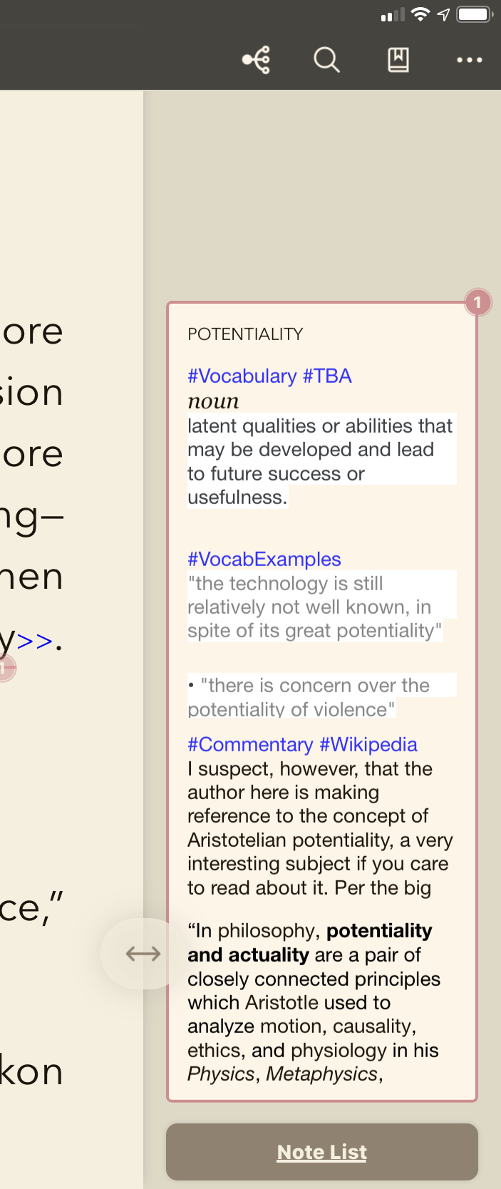
[Image 1] A note has been written with separate sections.
[Image 2] As a note in the sidebar, it looks ok, but it crops out the full information (can we bring scrolling back within a sidebar note like we had in the original old Marginnote? I LOVED being able to scroll through without opening a new window or expanding the note).
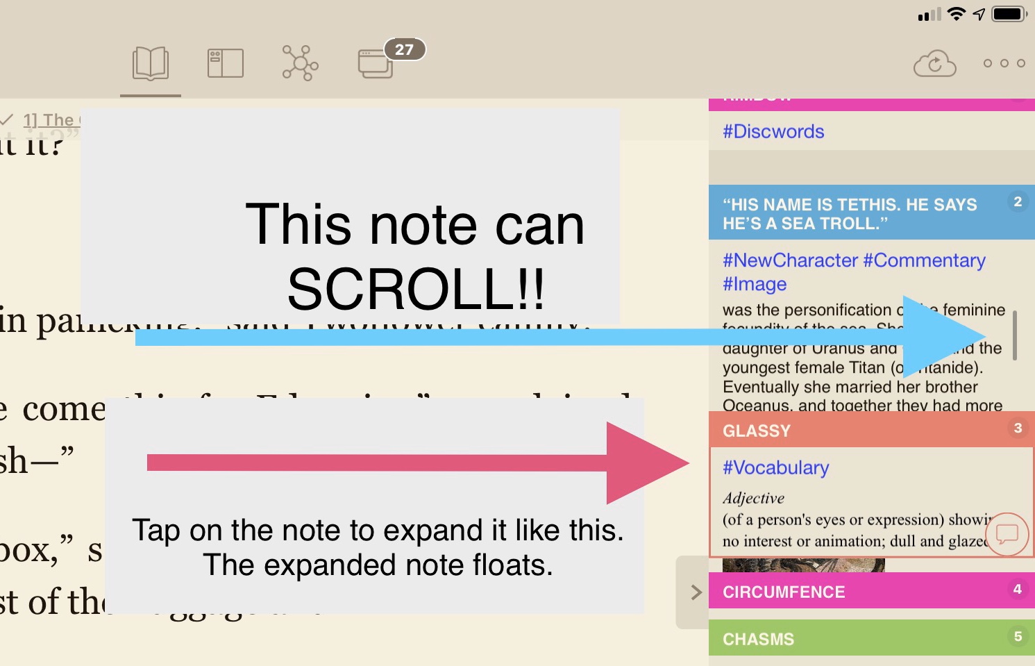
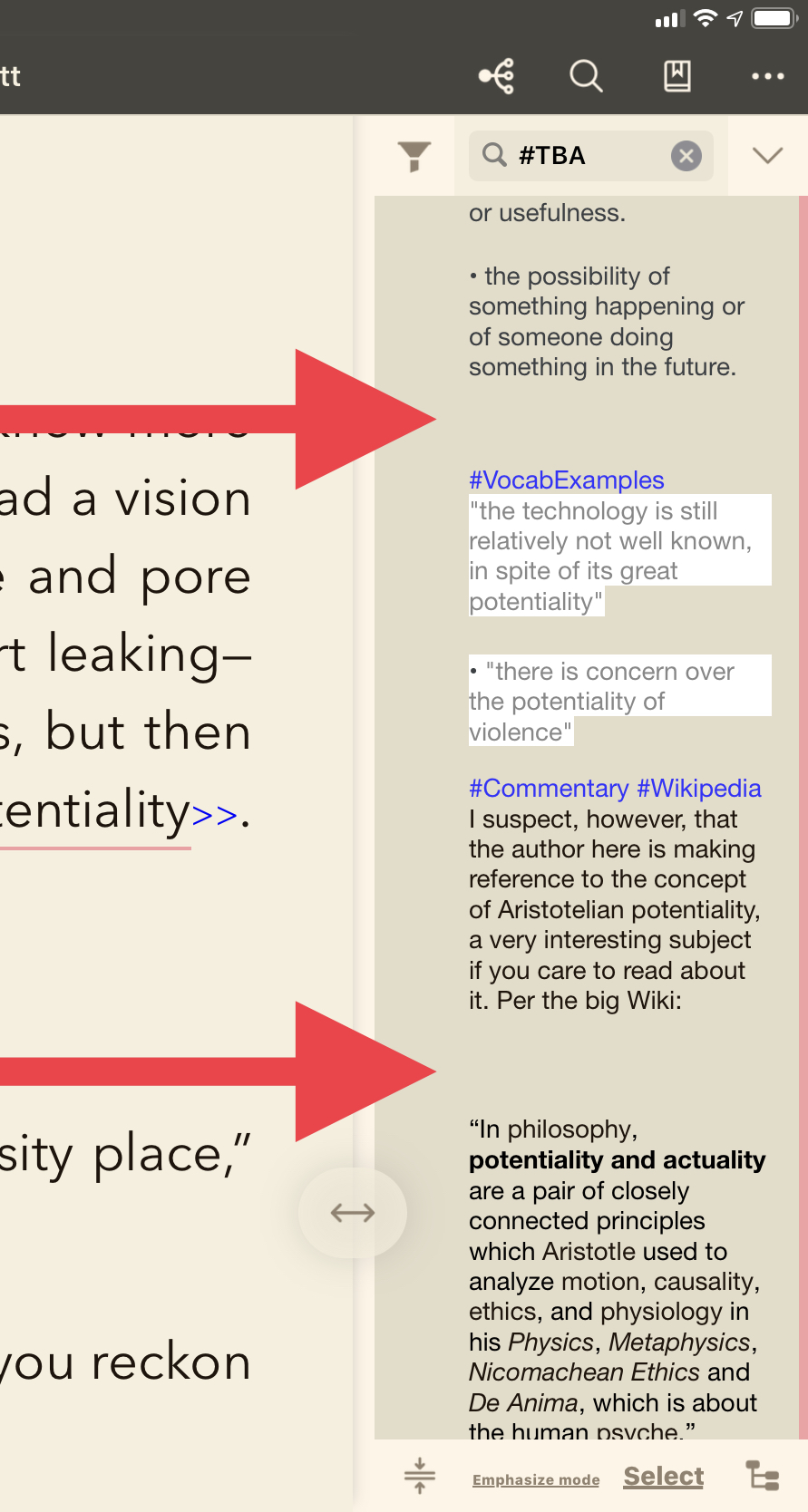
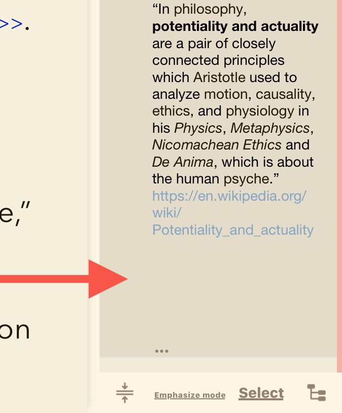
[Images 3/4] In “Note List” mode, the note is expanded, but as you can see there are unnecessary gaps between the sections, making it ugly and unwieldy. They take up more space than they need to. There is also an unnecessary gap at the end of the note.
So what can be done? MarginNote 2 had a partial solution. The following images present a possible solution: