As a heavy annotator, I continue to use MarginNote as my go-to book app. However, there are two simple issues that bothers me regarding the app’s readability. And both are easily fixed.
The first is an issue of readability, the second is a much more basic issue of legibility.*
Problem #1
Angle Brackets and ReadThe angle brackets for expanding a note in-text clutter up the screen. Below are three examples of heavily annotated pages.
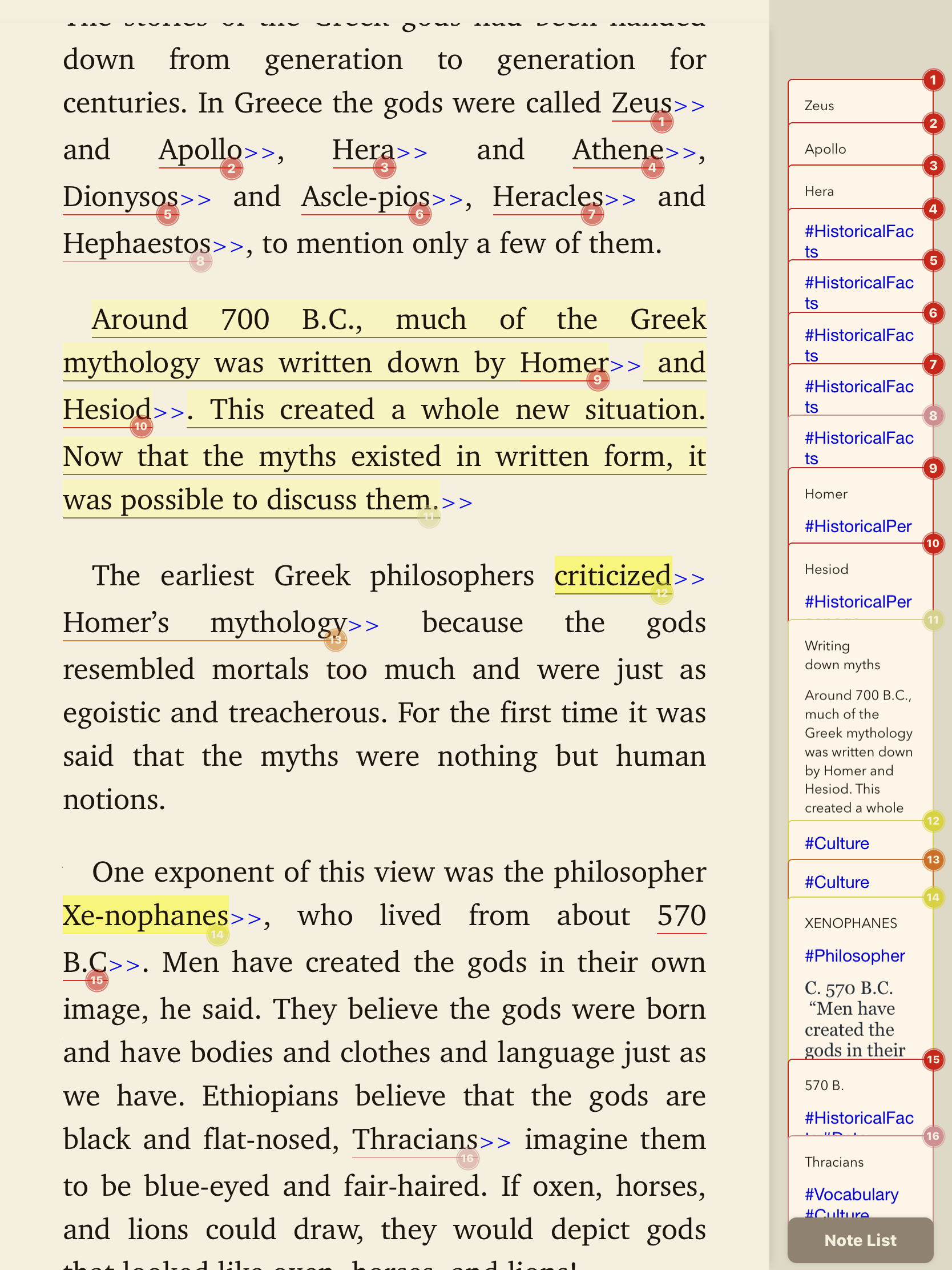
Image 1A. The first image show angle brackets (>>) after each highlight. These brackets appear whenever a note,hashtag, or title is added to the highlight. The brackets break up the text and damage the readability of the page. The eye of the reader has a harder time scanning the page. When shown alongside the note side panel, it it absolutely atrocious (Image 1B).
Image 1A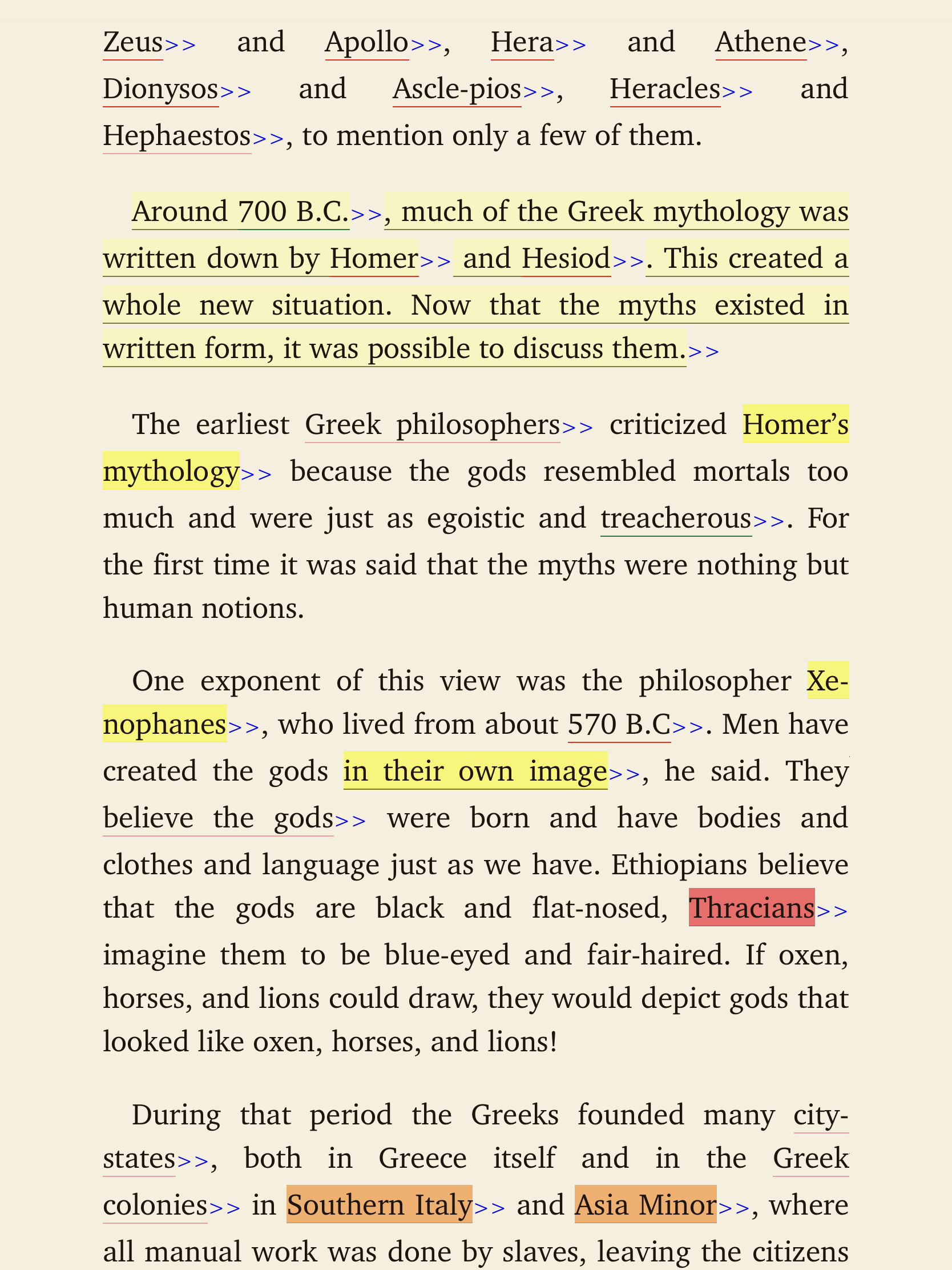
Image 1B
—
Image 2 shows a compromise. The brackets appear only at the end of the paragraph, although it still shows too many of them cluttering up the page. One bracket would suffice. This format appears occasionally in some MarginNote books, most often I’ve noticed when the notes contain many image. This is a good approach, but not the best.
—
Image 3. This is a screenshot of an equally heavily highlighted page. I haven’t added any notes yet, so there are no >> angle brackets. Do you see how much cleaner and more legible it appears? By their nature, the highlights do affect readability, but here they are less intrusive and don’t affect the layout of the paragraphs. I think perhaps just abolishing brackets altogether in favor of an “Expand” button in the main bar would be the best approach. Image 3
Problem #2
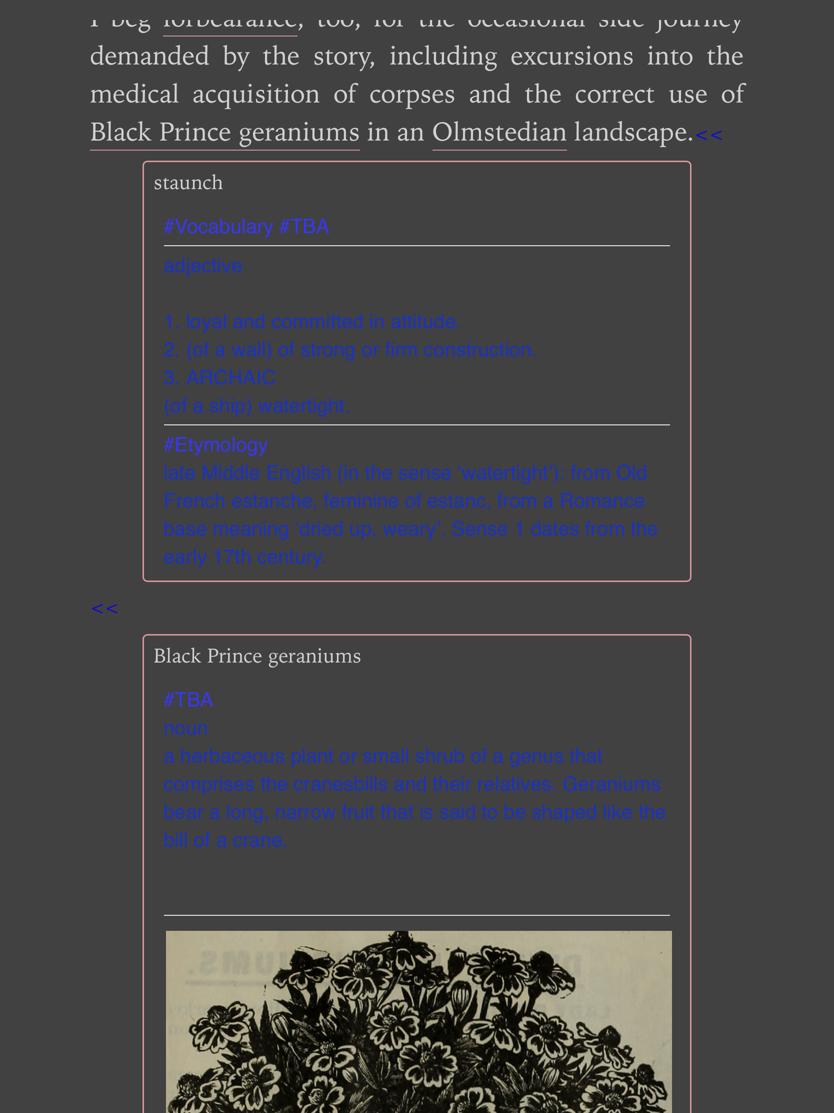
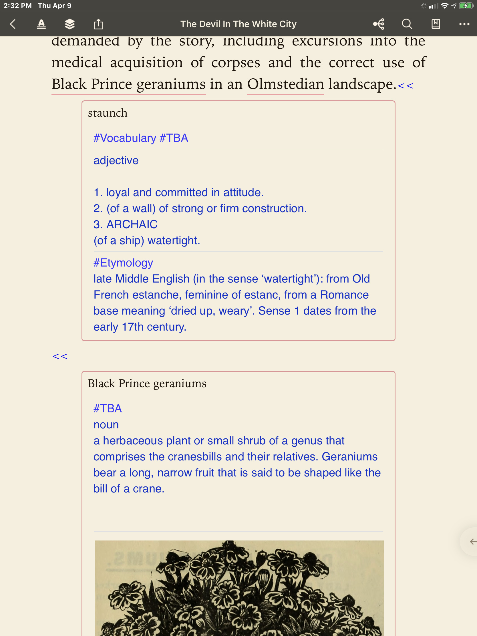
In-text notes when expanded are presented in dark blue text. It’s difficult to see when reading in “Dark Mode”.
The following two images show the same expanded notes; one in sepia, the other in Dark mode. Blue is not ideal to say the least. If the blue text changed (like the note title does) into a lighter font, this would be fixed immediately.
_ _
*In case you’re you’re wondering what the difference between readability and legibility is:
Readability refers to how “pleasing” a text’s layout and design are on the eye and brain when scanning a page. Readability affects the reader’s speed, attention, and ultimately comprehension. Imagine if you had to read an entire novel in ComicSans or Papyrus.
Legibility is how clear and decipherable a text is. ComicSans is legible insofar as you can tell what words are on the page. Naturally, writing must be legible before it can be readable, but not all legible text is equally readable. Font isn’t the only thing that affects readability.
/For/Instance/If/I/put/a/slash/between/every/word/in/this/sentence/,/it/,/is/still/
legible/,/but/it/is/not/quite/so/readable/and/you/would/get/tired/of/reading/it/
very/quickly/,/perhaps/after/only/a/page/or/two/./