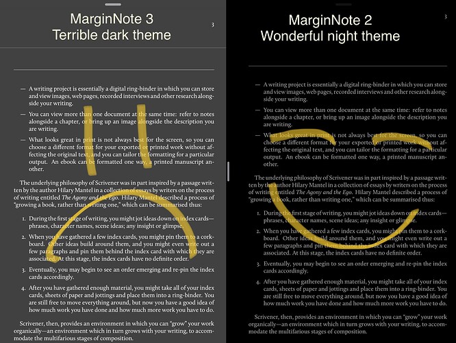
What is with the new grayish dark “style,” is this a bug or really the intended color??? It’s not good on the eyes at night. Can we please get the option to get the old black background like it was in the previous version of MN3? Really concerning because I have most of my research and personal reading in MN3 and this gray color I can’t read at night like the previous version. It’s not relaxing for the eyes at all. If not, let me know and I’ll start exporting everything out. This and Evernote export (also not working) are the sole reasons I used MN3. Thanks
It seems you’re using IOS version. We just optimized color of Dark mode to get better contrast when IOS Dark mode is turned on in the not so much dark environment(As many users even use Dark mode in the daytime).
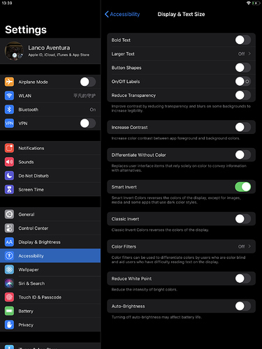
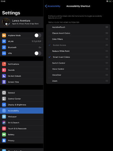
If you’re often working in an extremely dark environment. It is more suggested to use Smart/Classic Invert Colors by IOS Accessibility Shortcut.
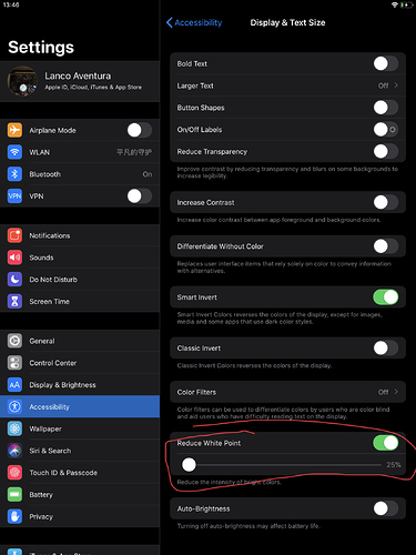
Meanwhile, if you prefer the color of MN inner Dark Theme. You cloud adjust your brightness further by Reduce White Point. This option also could be turned on by Accessibility Shortcut.
About the Evernote issue. It would be nice to help us make it clear if you upload some screenshots.
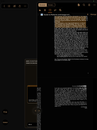
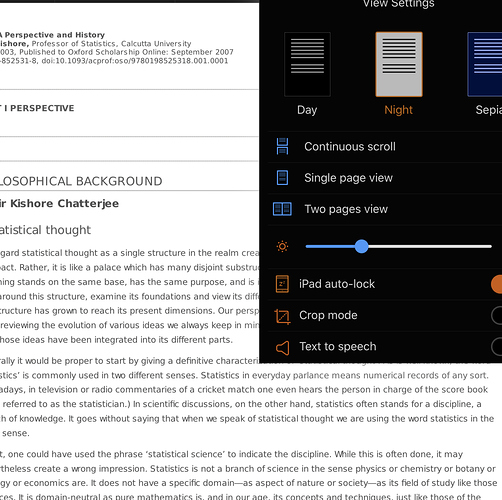
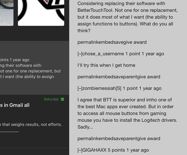
I do use dark mode all day and I use Margin in combination with many other apps (First pic is the documents app) swiping back and forth for reference. When smart invert is on, dark elements of other apps appear as white. You can see that it makes elements of Evernote appear white when it is in dark mode and it does the same to many other apps.
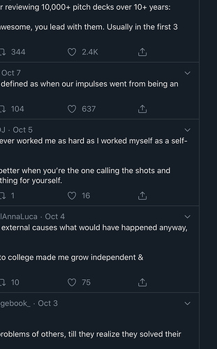
That also, is not good in the day or night with dark mode on. With reduced white point on, I completely lose the grid in audio production apps (3rd pic) I use at the same time I’m referencing in MarginNote. Even if those weren’t an issue, I don’t want to go into iOS settings and adjust things every time I want to read something. You can see my point? I like a simple black background to always be on when I have iOS set to dark mode.
As far as the Evernote issue, I can go to studying export then send to an Evernote notebook and it does not appear as it did before. No data is passed to it.
iOS dark mode on, this is how dark mode looks in the icab browser and Tweetbot as well. They both look great without having to mess around with system settings. Honestly, this and broken Evernote export are show stoppers for me using the app! 
Thanks for your detailed report. We will try to handle this issue. Your screenshots are really helpful to improve the dark mode.
Thanks, I hope so. I’m on the verge of migrating out of MarginNote to something that has a black dark mode like Margin note previously had. After years of using MarginNote it’s not something I want to do, but I have to be able to read research comfortably. The current dark grey background should indicate something that is “selected” or at a higher level according to most dark UI guidelines.
Let Apple do your research for you, take a look at reader view (dark mode) in Safari iOS. The background is dark, not dark grey. Take a look at Flipboard’s dark mode, it’s completely black. Both companies have a big teams and have thought a lot about this.
Also, it would be great if there is a toggle so we can control if the style will change as Mac’s dark mode is on…
I prefer to use the default style (pure white) all the time, while it will change the “Night” automatically…
Absolutely agree, please add a real dark = black background!
Who here likes the grey background? Personally think it doesn’t look good in day or night.
I agree 100% with Djm. I just bought the iOS version, and I’m considering whether to buy the Mac version and commit to MN3 as my main tool, but this is possibly a dealbreaker. There’s no reason to be clever here! Just copy Apple’s night mode! We shouldn’t have to mess around in settings, especially when that messes up other apps that do this right. Keep the current style as “dark gray or whatever”, but give us a real night mode. And yes, please put in a “match iOS dark/light” setting!
I should add that this app seems awesome in many ways, and I appreciate all the effort! I’m just frustrated by something so simple that has such a negative impact on usability.
2 years later… dear developers, please tell me why you are so indifferent to the requests of your customers??! I really can’t understand why two years later you can’t just bring back the black theme. Real night theme. Why? Imagine that all this time I use MN2 more often than MN3 with all the restrictions just because of the black theme. And I feel like I’m not the only one. Nobody asks to remove the gray theme, maybe someone really likes it, just add a black one. And that’s all. It’s so simple. Guys, seriously, 2 years have been asking you for this.
This is not a solution. I’m sure you understand this very well.
Wholeheartedly agree and what’s marked a solution in the OP is not a real solution. It’s a kludgy time-consuming workaround that still doesn’t look nice. MarginNote 2 and the early version of 3’s dark mode looked right, just like your pic comparison. I’m using the Readwise beta of their reader app now and the dark color is a “real black,” as soon as that’s in App Store and completely stable I’m migrating everything PDF to it.
Dear developers, do you care what your customers say? You didn’t even give us an answer, do you plan to add a genuine black theme? If you don’t plan to, then tell me why? Why not? I will calm down and look for alternatives to mn3. I’m tired of waiting and hoping for new updates. Just say yes (and when?) or no?
