It seems you’re using IOS version. We just optimized color of Dark mode to get better contrast when IOS Dark mode is turned on in the not so much dark environment(As many users even use Dark mode in the daytime).
If you’re often working in an extremely dark environment. It is more suggested to use Smart/Classic Invert Colors by IOS Accessibility Shortcut.
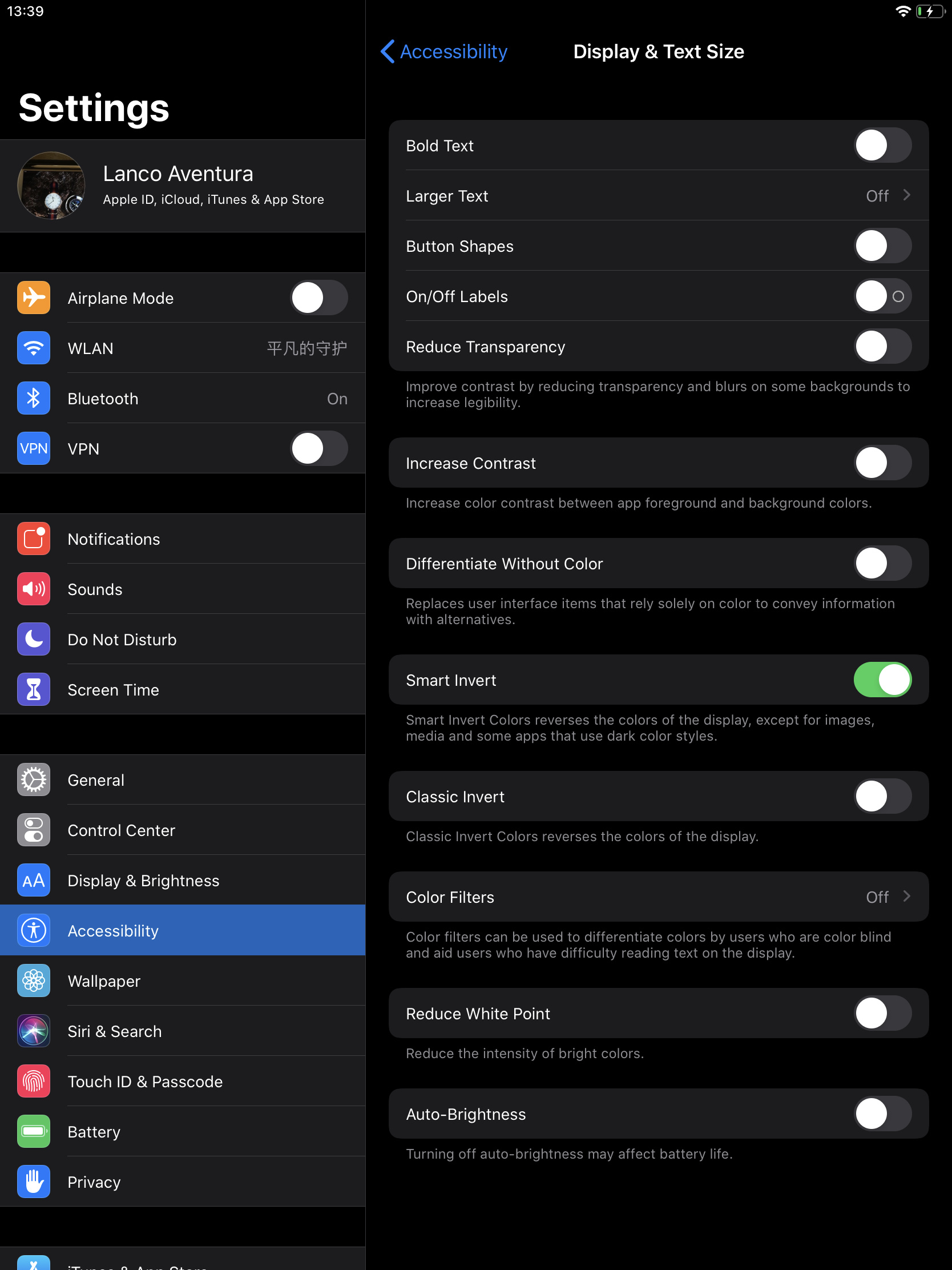
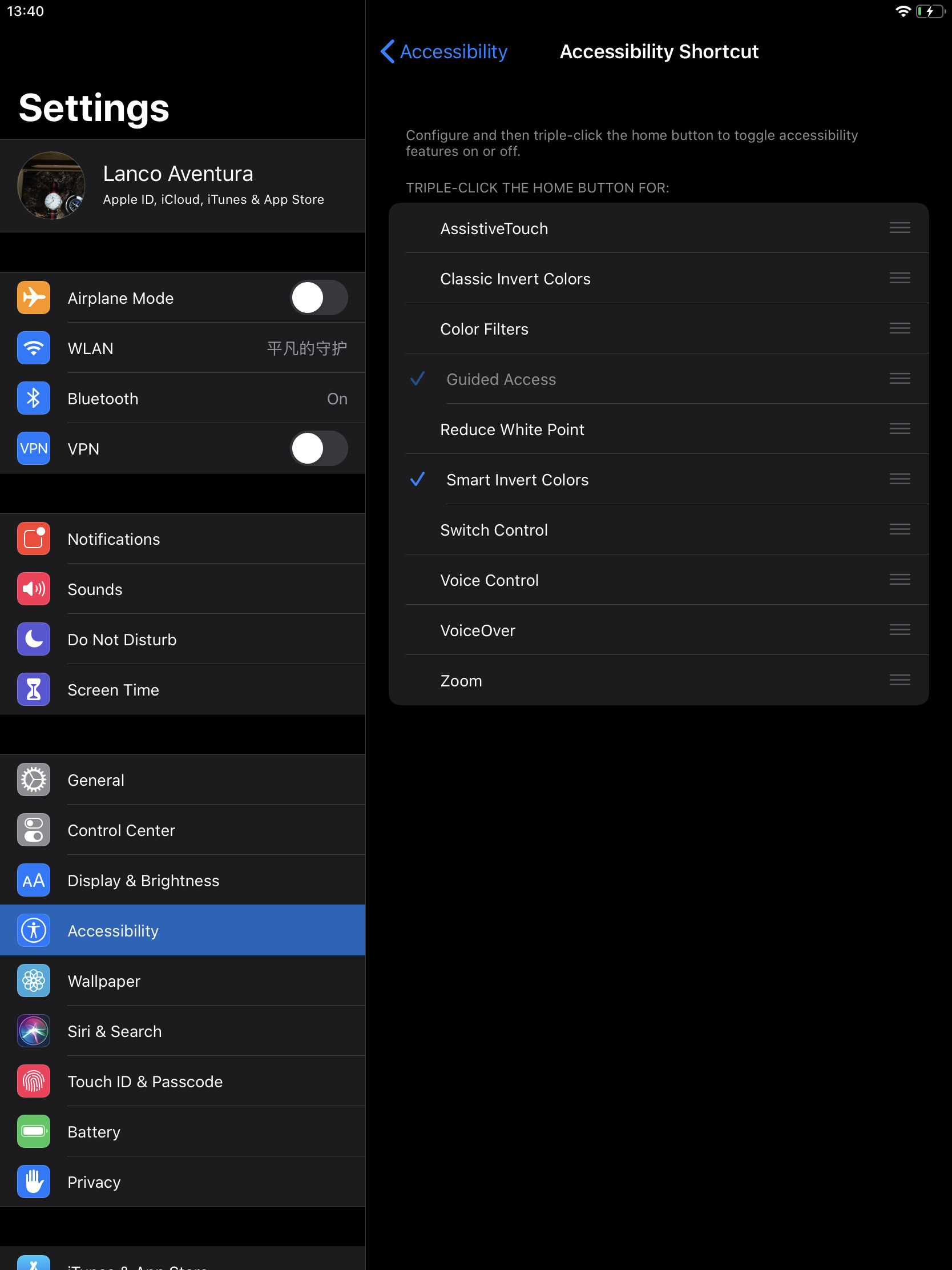
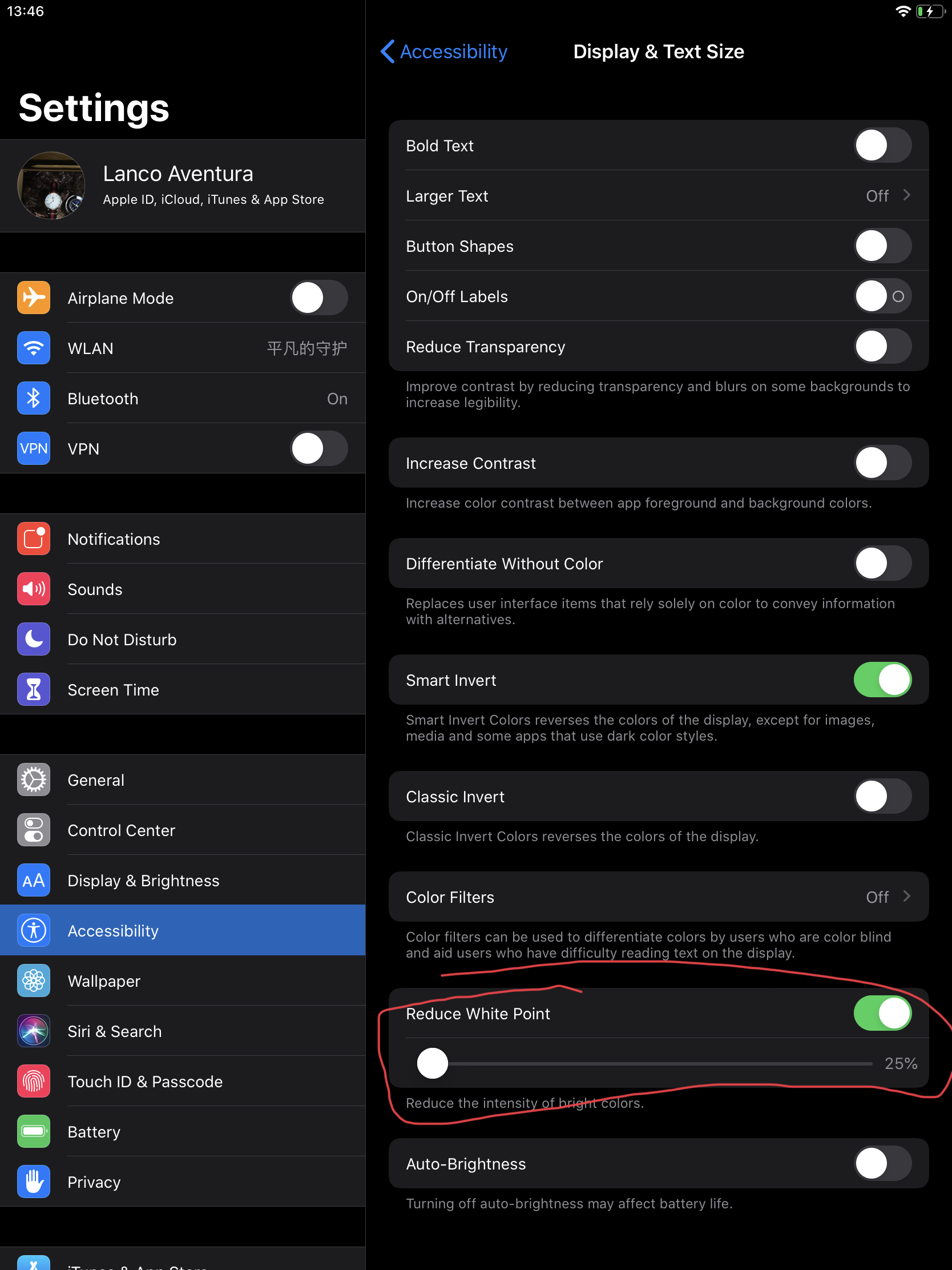
Meanwhile, if you prefer the color of MN inner Dark Theme. You cloud adjust your brightness further by Reduce White Point. This option also could be turned on by Accessibility Shortcut.
About the Evernote issue. It would be nice to help us make it clear if you upload some screenshots.